Upstreet Brewing Collective Websites
The Ask
The Upstreet Brewery empire is growing beyond Prince Edward Island and needed an online solution that could keep up.
We quickly realized that we were looking at a solution for not just one business, but for four.
The Analysis
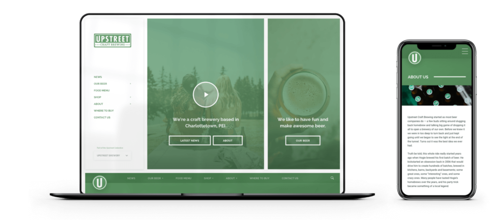
Upstreet’s presence online needed to be modernized. It was hard to update and wasn’t responsive for browsing on smaller devices or phones. They did have a cool comic book illustrative aesthetic that we wanted to give a nod to and use as a building block when forming our art direction.
Upstreet is very involved in their community, supporting the local artist’s with the ‘Do-Good’ program, always hosting events and they were the first PEI business to gain B Corp Certification and they make a great beer to boot, just all around great people! Their new website needed to make it easy to share these stories, get more people involved in the community, and of course keep their customers up-to-date on the latest brews.
Right from the get-go, Dose was super organized and professional, but totally laid back and chill. Kinda like building a site with your buds, except we got to sit back and drink beer while our buds did the heavy lifting.
– Marsha Gallant, Upstreet Brewing
The Cure
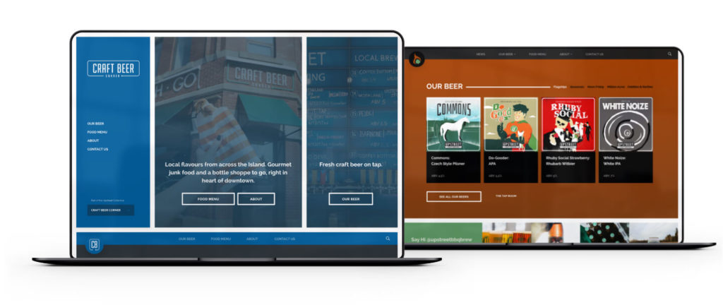
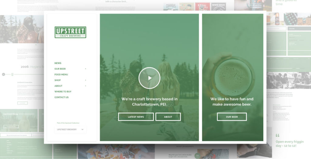
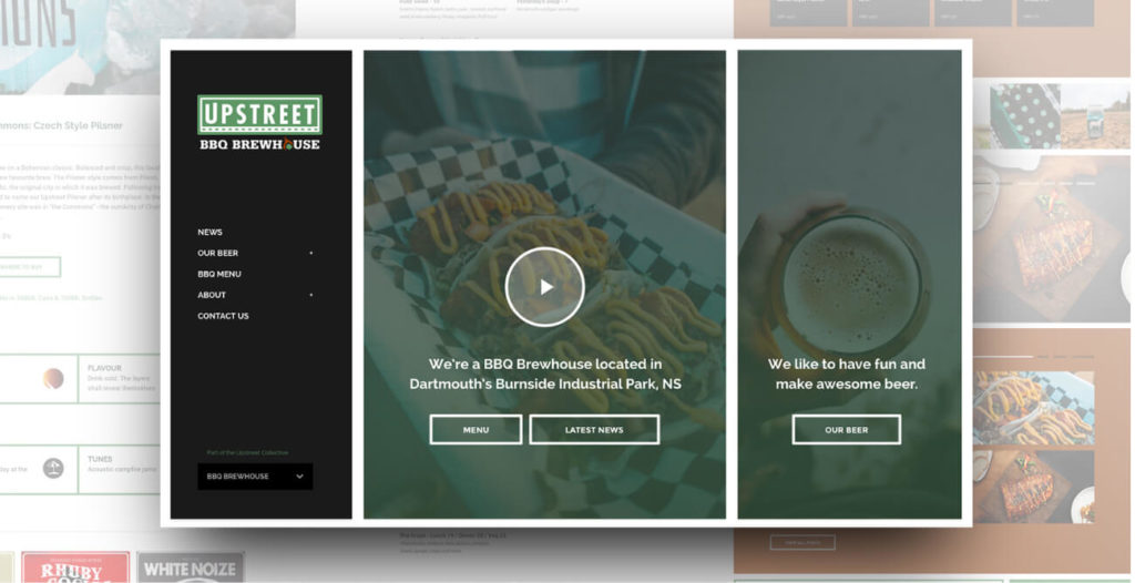
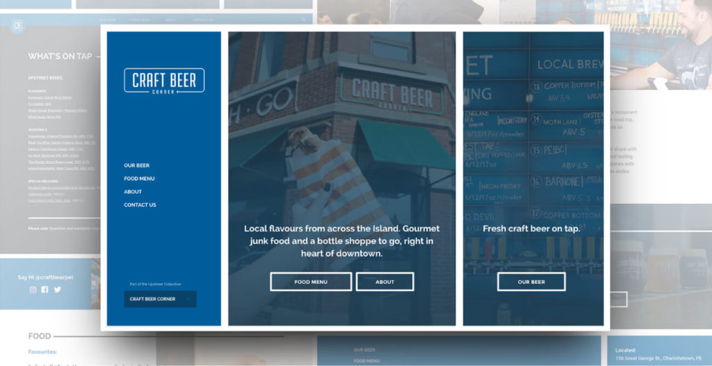
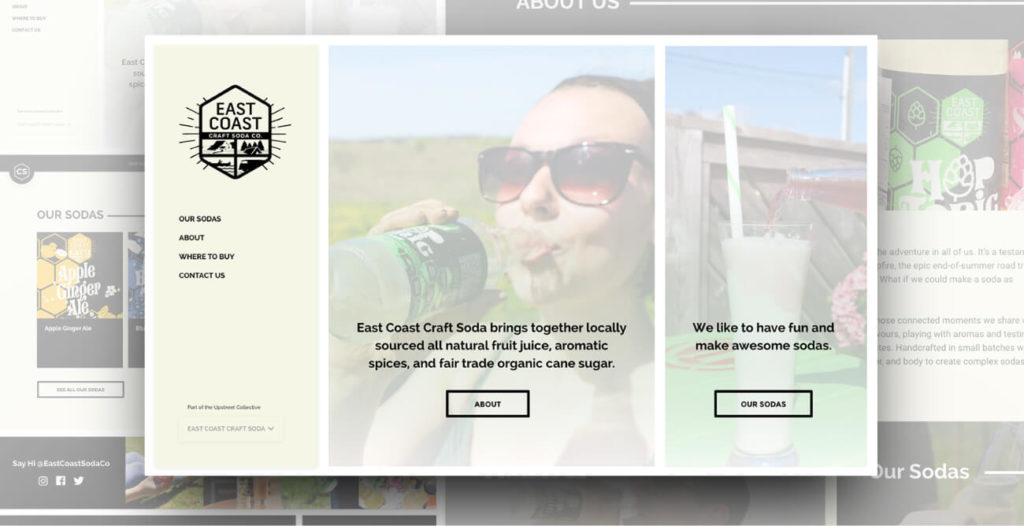
After much deliberation, we decided to tackle the entire Upstreet collective group of sites with one custom theme. This theme would need to be super versatile so it would meet the needs of each of their properties – the parent brand, Upstreet Brewery and then three child brands: Upstreet BBQ Brewhouse, Craft Beer Corner and East Coast Soda. This is where the comic book inspiration came in. We built a modular system of layouts that could accommodate the information needed for each one of their websites. This modular system was styled with boundary boxes and thick lines to separate content, making it easy to read just like a comic book spread.
We started with the parent site, Upstreet Brewery which required the bulk of unique layouts to display their store, food menu, beer list, taproom, blog and where to buy map. Throughout the design process, we compared each brand against the others and tested the layouts to ensure we were creating a solution that would indeed fit each business perfectly.
[Underneath every Upstreet beer bottle cap is a short PEI saying. We incorporated this into the sites. Whenever you hover over the sites’ icons, it randomly pulls a saying from the database for a quick chuckle.]
The result was a fresh collection of sites that are clearly related to each other. Now when you visit a website within the collective, you immediately know it’s an Upstreet business, but they all stand alone and serve their individual purpose. This solution saved the business a ton of money; there was no need to build four unique sites with this many commonalities when they could all work together as a family. We can’t wait to see what Upstreet comes up with next!
Check it out – upstreet.ca
From the first meeting with Dose, we know they were the ones to take our brands to the next level. Their attention to detail and knowledge of their craft put us at ease, and their chill personalities made it easy to discuss any new ideas or changes along the way. It was a fantastic experience and the sites and service far exceeded our expectations.
Project Numbers
-
4Websites
-
32Research samples
-
1Solution for 4 websites
It’s a unique challenge in designing and building a theme that needs to span across 4 businesses with their own unique requirements.
DOSE Media
