Garrison Brewing Beer Packaging
Overview
When Garrison Brewing Co. knew they had some unique new beers on their hands – they came to Dose to help wrap their latest products, inject some new life into the branding and bring them to market with a bang.
The Analysis
The craft beer market is exploding to the point that the largest manufacturers in the world are hiding their name in the fine print on labels and adding small; local batch inspired facade’s on the front to masquerade the audience.
Standing out on the shelves at the NSLC is a daunting task with the biggest players in the game competing for consumers attention.
The Cure
You’d be hard pressed to find more knowledgable craft beer enthusiasts than those that man the helm at Garrison. They know the market inside out and have been evolving with the industry for over 20 years. We sat with their team several times to go over various mood boards and visual tactics we could implement to give their product a competitive edge.
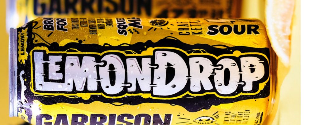
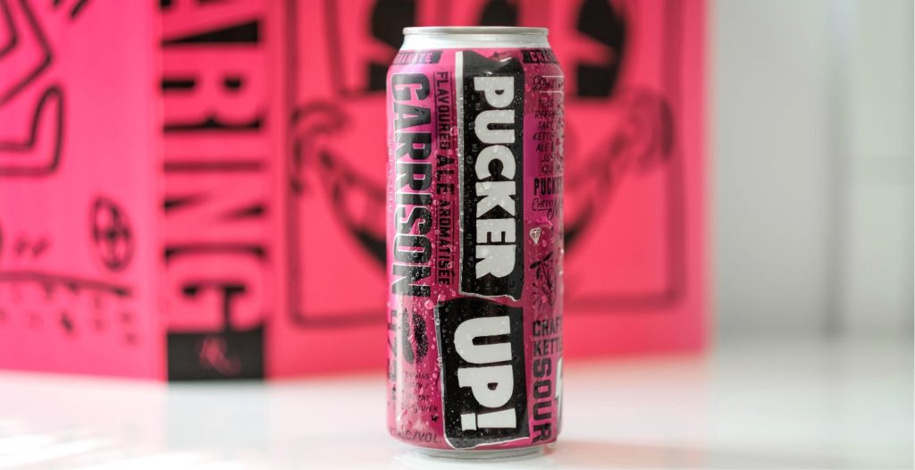
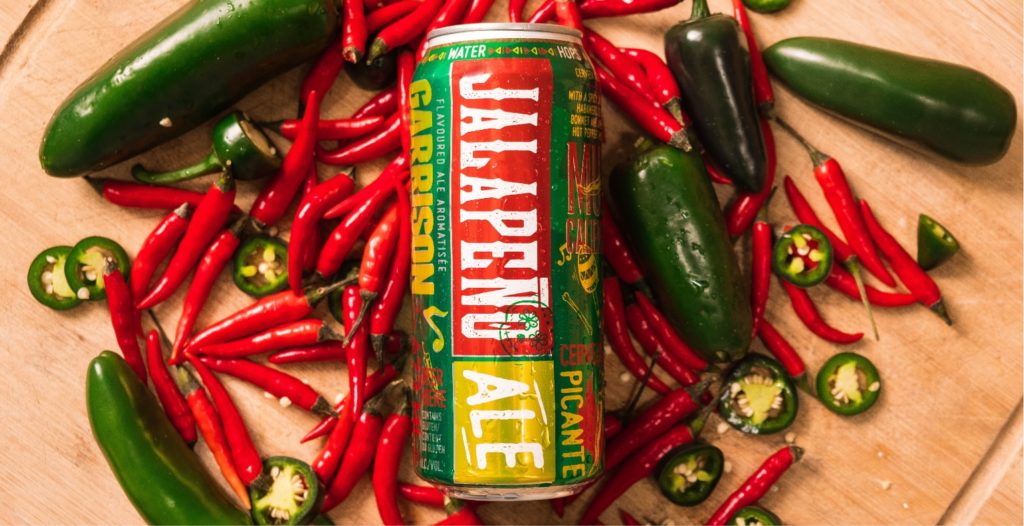
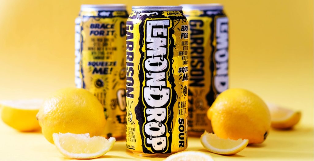
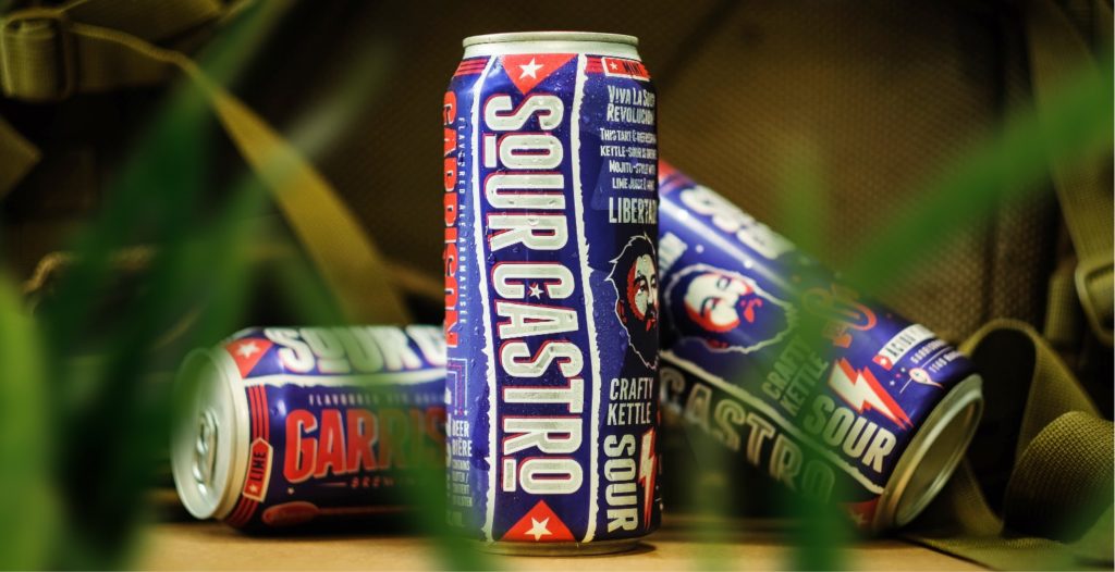
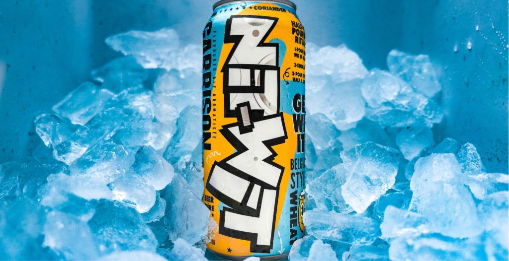
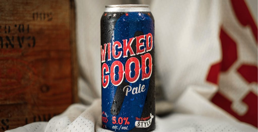
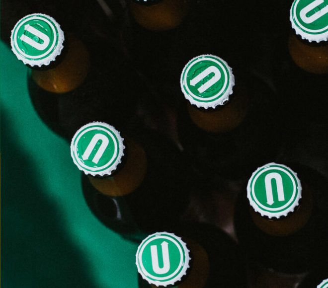
The first to market was Pucker Up!, a kettle sour infused with pomegranate. We created a hot pink can that was a massive hit with the beer flying off the shelves province-wide. The sideways text on the can be served as a perfect trial run to test the waters for the spring/summer initiatives and soon became synonymous with Garrison seasonals as we rolled it out across their entire lineup. The new flavours have been well received and have helped propel their product into markets previously untapped.
Consumers now know to look for the zany cans with sideways text to find Garrisons delicious beer.
Project Numbers
-
10Cans designed last year
-
4Scrapped directions
-
42Beers consumed while designing
Packaging for wobbly pops – it doesn’t get much better.
DOSE Media
Related Case Studies
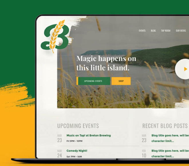
Breton Brewing Website
Breton brought Dose in to help define the goals of their website and strategize how we could evolve it into a tool they can leverage every day to share their story and connect with their customers.
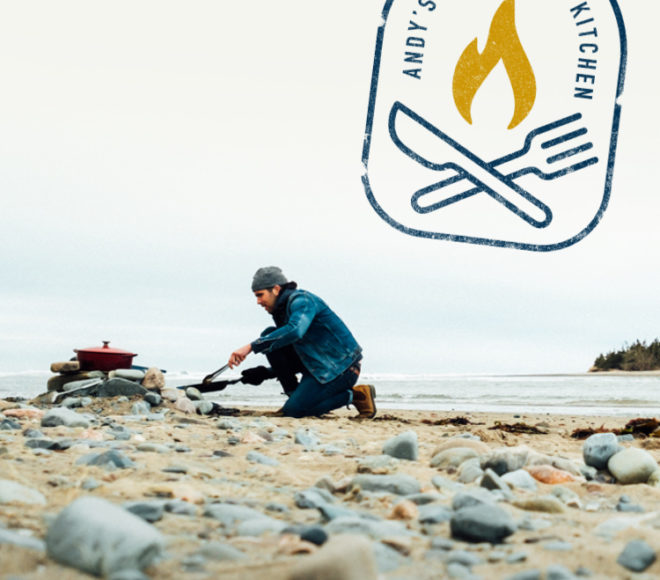
Andy's East Coast Kitchen
Andy Hay was the runner-up in season 5 of CTV’s MasterChef Canada. After filming the show, Andy approached us to talk about his experience, and how we could help him with branding and building a website for him to capture this audience and position himself for long-term success.
Upstreet Brewing Websites
How we designed a common website theme for Upstreet Brewing's Collective of businesses. Read more about the strategy behind our approach and execution.
Breton Brewing Website
Breton brought Dose in to help define the goals of their website and strategize how we could evolve it into a tool they can leverage every day to share their story and connect with their customers.
Andy's East Coast Kitchen
Andy Hay was the runner-up in season 5 of CTV’s MasterChef Canada. After filming the show, Andy approached us to talk about his experience, and how we could help him with branding and building a website for him to capture this audience and position himself for long-term success.
Upstreet Brewing Websites
How we designed a common website theme for Upstreet Brewing's Collective of businesses. Read more about the strategy behind our approach and execution.