Alexander Keith’s Packaging
The Ask
Many people don’t realize that Alexander Keith’s is partitioned into two separate entities. There is the massive conglomerate that oversees the production of the main staple – Alexander Keith’s IPA. Then there is the small batch local stuff that, to this day, is 100% crafted in downtown Nova Scotia at the old brewery.
The local Keith’s products have long gone through an identity crisis due to internal politics and red tape. HOOOORAAYYYY, these are the problems we love to solve. They approached Dose with open arms and were thrilled at the idea of jumping back to the drawing board in an effort to restructure the foundation of their brand.
The Analysis
Alexander Keith’s is much more than a beer to us fellow Nova Scotians; it is symbolic of our local pride. I remember being a kid and seeing those old vintage cans in the back corner of the fridge – there’s a lot of nostalgia surrounding their brand identity. Over the coming decades, we’ve seen numerous renditions of the packaging – some more preferable to us than others, but all very much true to their origins.
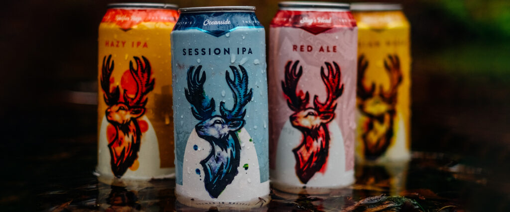
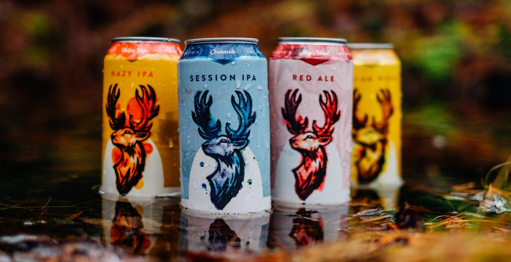
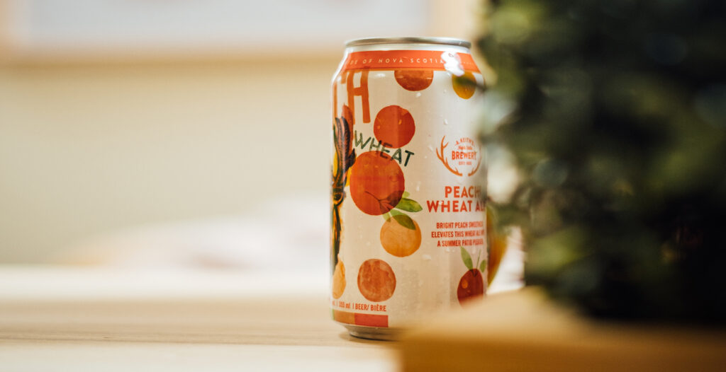
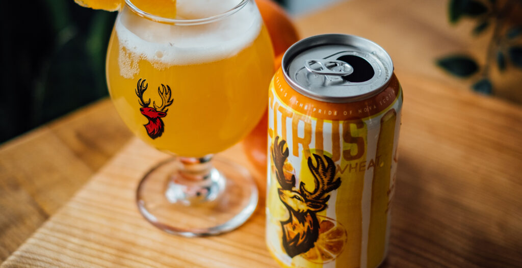
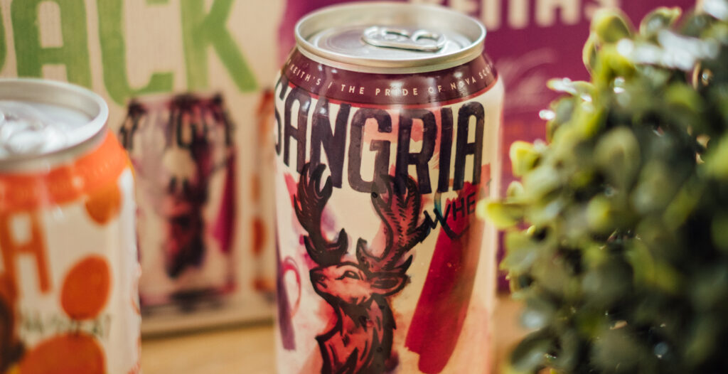
If you walk up to any random Nova Scotia beer drinker and ask them to describe a Keith’s can off the top of their head, you’ll most likely hear ‘It’s red, green and has a deer on it’. Those are the key elements from a visual standpoint that come to mind. The issue at hand is their ultra symbolic of the mainstay – Alexander Keith’s IPA.
Internally they have always drawn a clear distinction between the IPA and their small-batch local products. While we think it’s smart in some regard to keep them separate, we thought it would be crazy to not at least explore a rendition where we piggybacked off some of the equity they had built in their mother brand.
This led to some great dialogue with the team as we weighed the pros and cons of going in that direction. On the one hand, you could steer the craft beer drinker away from the product as it could come across as too reminiscent of the IPA. On the other hand, it could excite a massive audience about the idea that they can drink Keith’s while partaking in the craft beer culture. Our design exploration led us down many different paths, but ultimately we chose the latter.
The Cure
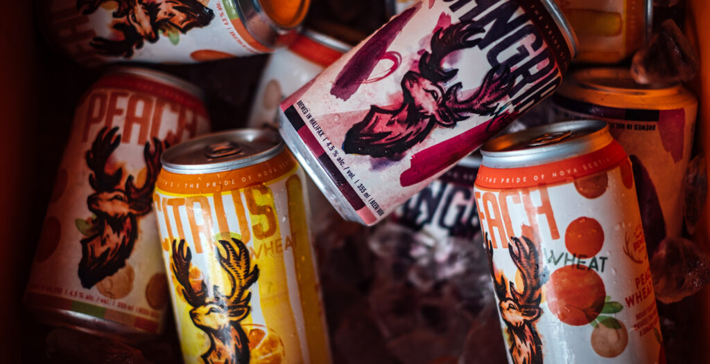
The finished design system is one that we’re all incredibly proud of. It was a massive collective effort from the entire team. The staff at Alexander Keith’s had a lot of concrete data for us to validate the hierarchy in our design elements and messaging, and in the end, we landed on a modern rendition of the age-old staple – the stag head.
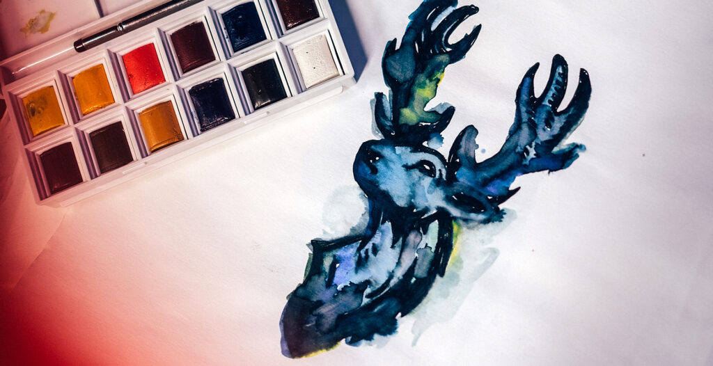
Nova Scotia is well known as Canada’s Ocean Playground. We live in a place that is ever changing as it is carved by the sea. That intrinsic sentiment lead us to watercolour all of the cans by hand, giving each one a special little unique trademark.
While it’s important that the new look was well received by the consumer, it was just as important to us that it was embraced internally by the team at Keith’s. We made it our mission to give them more than just a shiny new can design, but inspire them through our thinking to look at themselves differently. To get up and head to the shop each day and be excited about what they represent – an evolution of a product that transcends generations.
Now our kids (Generation Alpha) yell “Daddy, daddy made that!”, when we’re driving down the road and they see a billboard showing off the same cans they see in the back corner of their fridge. That’s the beautiful thing about packaging; it can hit ya right in the feels.
K, we’re tearing up a little here. Go drink a Keith’s; they look super cool now. Bye. xo
Project Numbers
-
10Design Concepts
-
1Clients converted to BFF's
-
A ZillionStokedness
Alexander Keith’s is a staple of The Maritimes – we’re proud that we were able to add our own touch to this iconic brand.
DOSE Media
Related Case Studies
Upstreet Brewing Websites
How we designed a common website theme for Upstreet Brewing's Collective of businesses. Read more about the strategy behind our approach and execution.
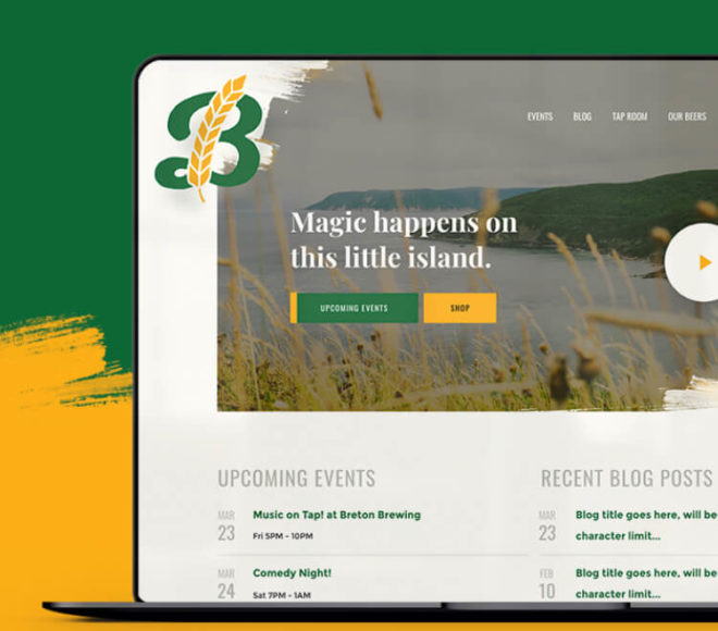
Breton Brewing Website
Breton brought Dose in to help define the goals of their website and strategize how we could evolve it into a tool they can leverage every day to share their story and connect with their customers.
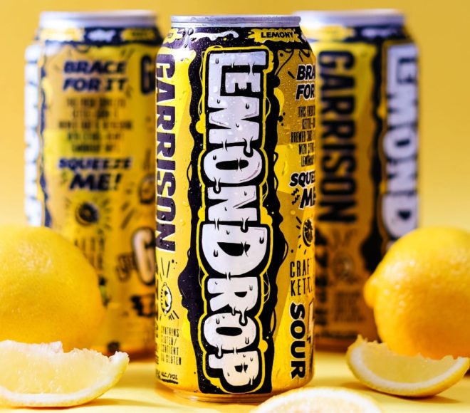
Garrison Brewing Beer Packaging
When Garrison Brewing Co. knew they had some unique new beers on their hands - they came to Dose to help wrap their latest products, inject some new life into the branding and bring them to market with a bang.
Upstreet Brewing Websites
How we designed a common website theme for Upstreet Brewing's Collective of businesses. Read more about the strategy behind our approach and execution.
Breton Brewing Website
Breton brought Dose in to help define the goals of their website and strategize how we could evolve it into a tool they can leverage every day to share their story and connect with their customers.
Garrison Brewing Beer Packaging
When Garrison Brewing Co. knew they had some unique new beers on their hands - they came to Dose to help wrap their latest products, inject some new life into the branding and bring them to market with a bang.