Quake Matthews
Overview
Quake Matthews, one of Canada’s elite underground musicians was looking for creative direction on his next project. He was channelling all of his energy into this next release and looking for assistance to craft some ideas to make a holistic body of work with a rollout that reflected the quality of the content.

The Analysis
It was important from the get-go that we looked at Quake as a product. To look past the album art and see the big picture. We sat down with him and his manager early in the creative process to hammer down exactly what we wanted to achieve with this. What nuggets could we grab ahold of and run with to help add depth to his image?
Quake has always embodied a classic hip-hop sound in his music. The rugged, golden age backpack era. Our early mood boards were a perfect reflection of the 90’s showing true authenticity to his sound and image.
Upon approval of the overall theme, we began laying out a blueprint for the 13 track album. How was the delivery going to take place? The flow of the music and how we would deliver it. That thinking and early groundwork are what would influence the theme of the entire creative process. By building the project up from a bird’s eye view, being able to see every detail from a holistic standpoint we were able to create a cohesive and well-balanced product.
The Cure
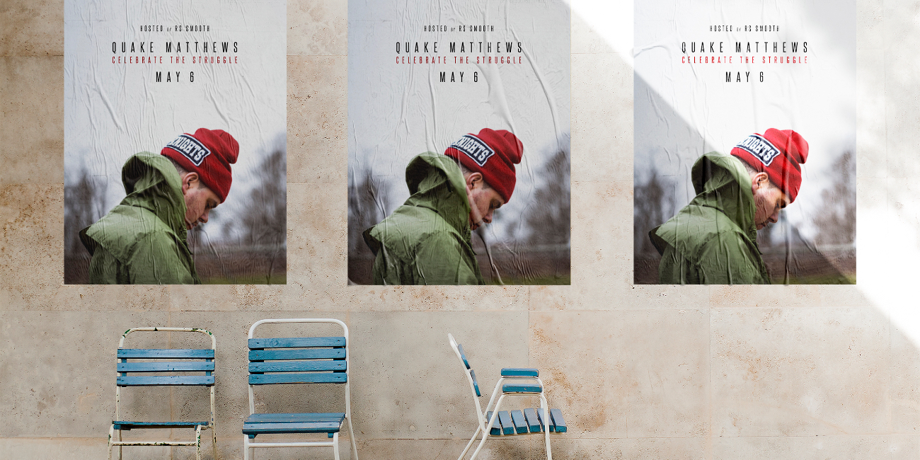
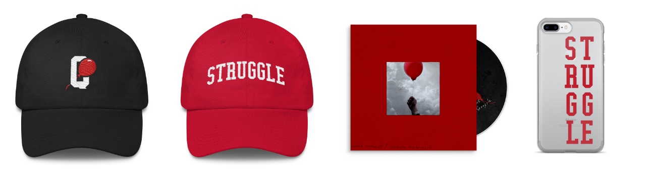
One of the first things we established was the name of the album. Celebrate The Struggle. The idea was to celebrate the hardships in life, regardless what the world throws at you, embrace it and know the rough seas are what make a skilled sailor. This foundation was looked at as the platform for the entire brand.

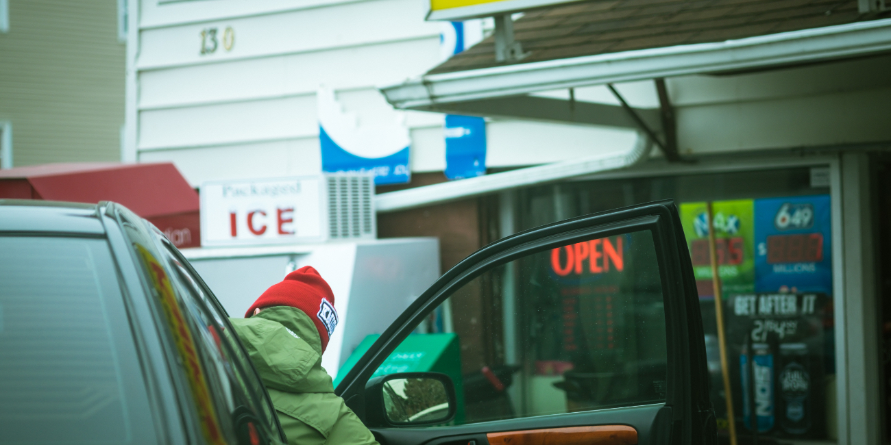
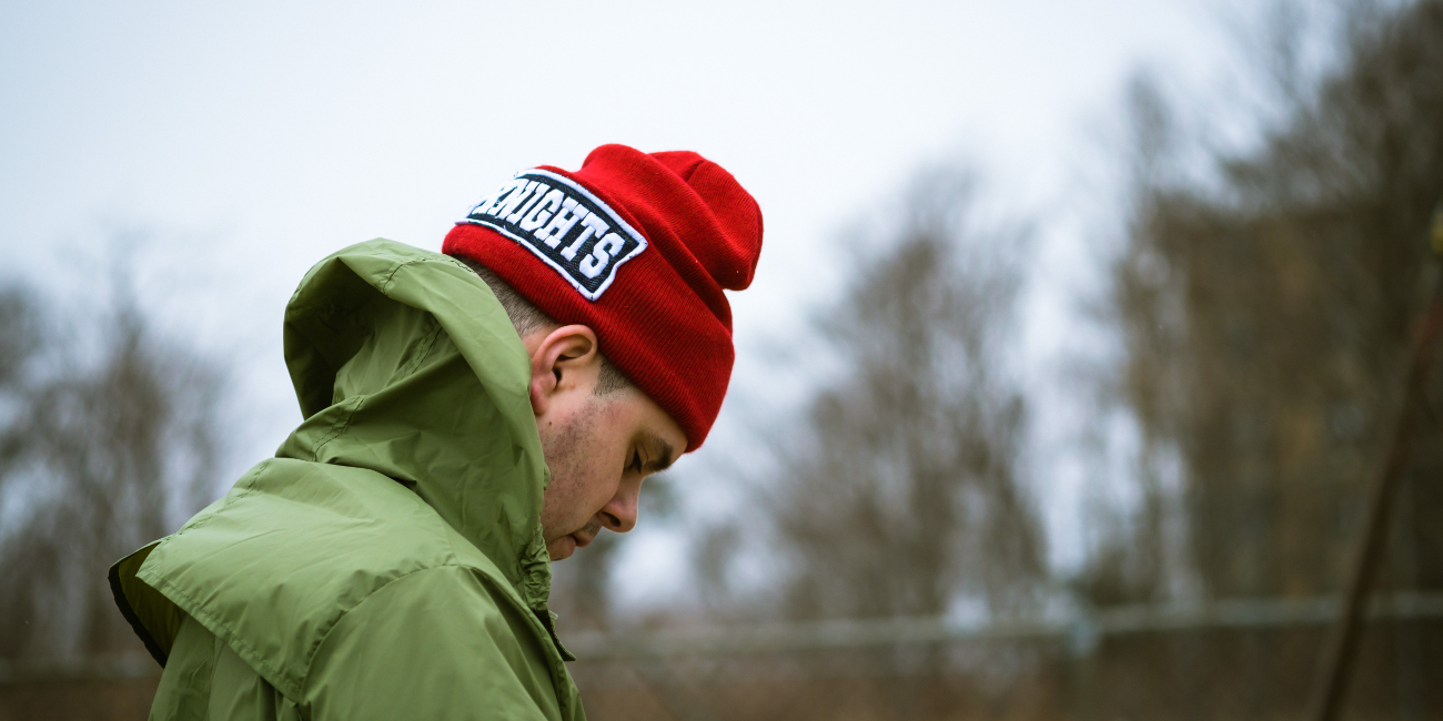
We crafted a colour scheme and image treatment that aligned with it tonally. Predominantly muted images were shot in a very candid manner as a means to draw the audience into the project and allow them to feel as though they were on a journey with him as he built his product.
We began the rollout with a teaser trailer to begin captivating the audience.
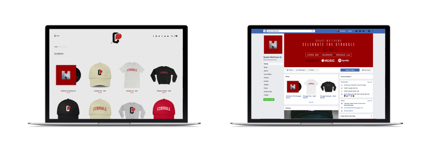
For two months leading up to the launch, we kept a steady flow of branded content flowing through his social platforms. A common theme amongst the imagery was a red balloon that became symbolic for the entire “Celebrate the Struggle” mantra. We had it hidden in the imagery and it became an interactive way for him to talk with his fans. They were looking for the balloons everywhere.


The night before the launch we had a listening party at the East Coast Lifestyle headquarters. The entire event was live streamed on Facebook giving fans worldwide the ability to hear the music for the first time and get insights into the story behind the project. By the time rush hour hit the next morning, the entire city was painted red with branded balloons with a call to action driving traffic to his website where you could purchase the album along with some amazing merchandise.
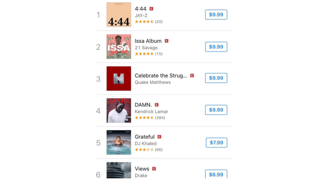
The launch was a huge success. The album shot to the number 3 spot on iTunes alongside Kendrick Lamar and DJ Khaled North American charts within 3 hours and even found its way on to Prime Minister a Justin Trudeau’s summer playlist.
Even after a year I strongly feel that people will always associate a “red balloon” to Quake Matthews and my album “Celebrate the Struggle”.
Project Numbers
-
A LOT!!!Spins of the album
-
153Km's driven location scouting
-
3Highest placement on iTunes
If you haven’t listened to Quake Matthews yet, do your ears a favour. And don’t forget to Celebrate The Struggle
DOSE Media
Related Case Studies
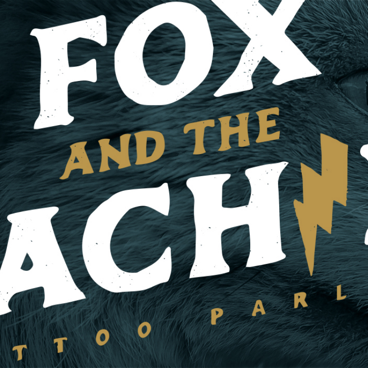
Fox and the Machine
Legend has it when they were plotting this venture in Dean’s living room, they were at a stalemate in name searching. And peering in the window at that moment was a red fox, staring right at them. The “Machine” was a nod to the tattoo equipment.

Paradigm Orthodontics
Dr. Andrew Emanuele represents a fresh face in the local orthodontist industry. He identified immediately that if his clinic was to be a success he would have to do something different to really stand out.
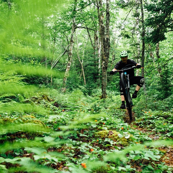
Mountain Bike Halifax
We worked with the association to help them establish a name, branding and a website to represent them moving forward.
Fox and the Machine
Legend has it when they were plotting this venture in Dean’s living room, they were at a stalemate in name searching. And peering in the window at that moment was a red fox, staring right at them. The “Machine” was a nod to the tattoo equipment.
Paradigm Orthodontics
Dr. Andrew Emanuele represents a fresh face in the local orthodontist industry. He identified immediately that if his clinic was to be a success he would have to do something different to really stand out.
Mountain Bike Halifax
We worked with the association to help them establish a name, branding and a website to represent them moving forward.