
Paradigm Orthodontics
The Ask
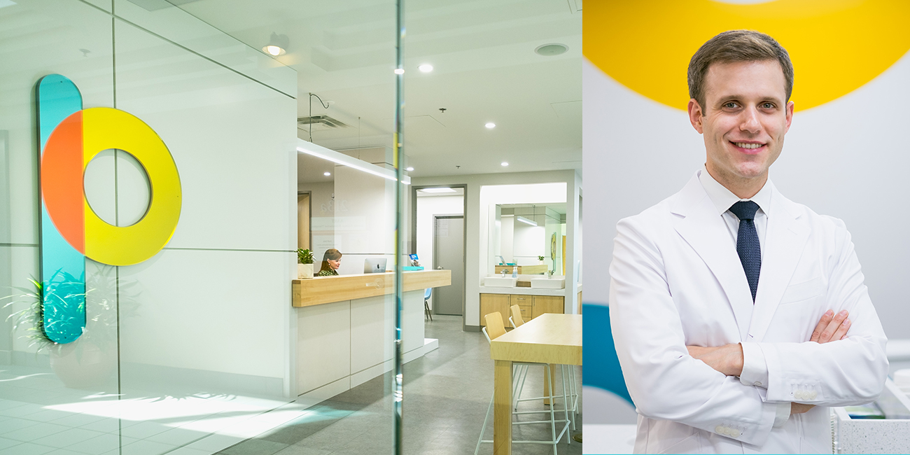
Dr. Andrew Emanuele represents a fresh face in the local orthodontist industry. He identified immediately that if his clinic was to be a success he would have to do something different to really stand out. We needed to create a brand with enough moving parts that it could manifest into not only their collateral and online, but morph into their physical space as well.
Their new venture needed a look and feel that reflected their zest and excitement.

The Process
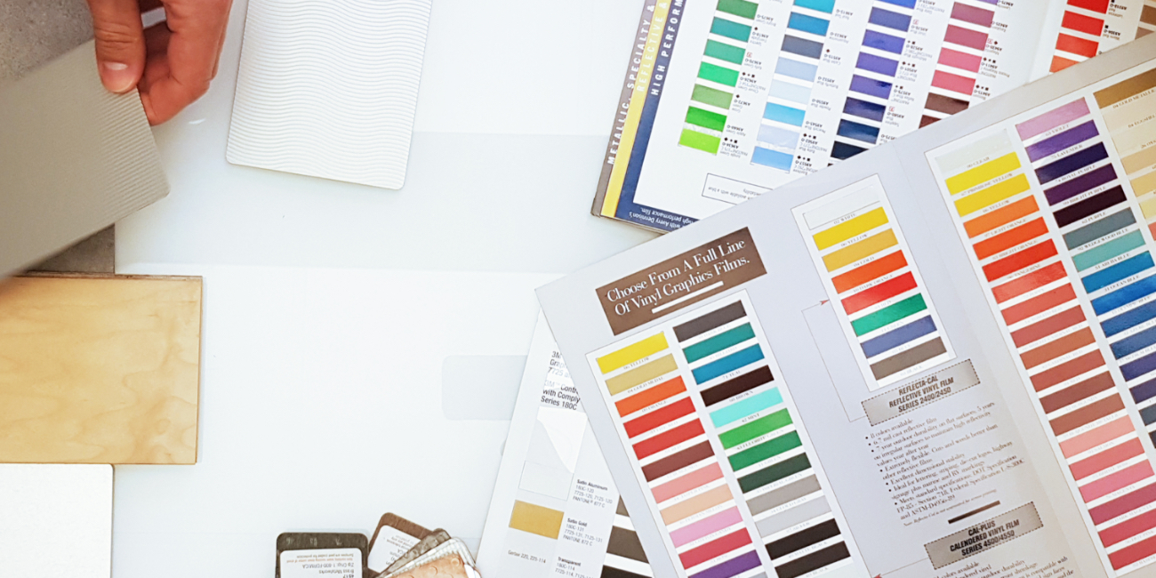
The market research showed us that most of his competitors came across very dry and uninspired. The same old drab dreary palettes and clinical boring offices.
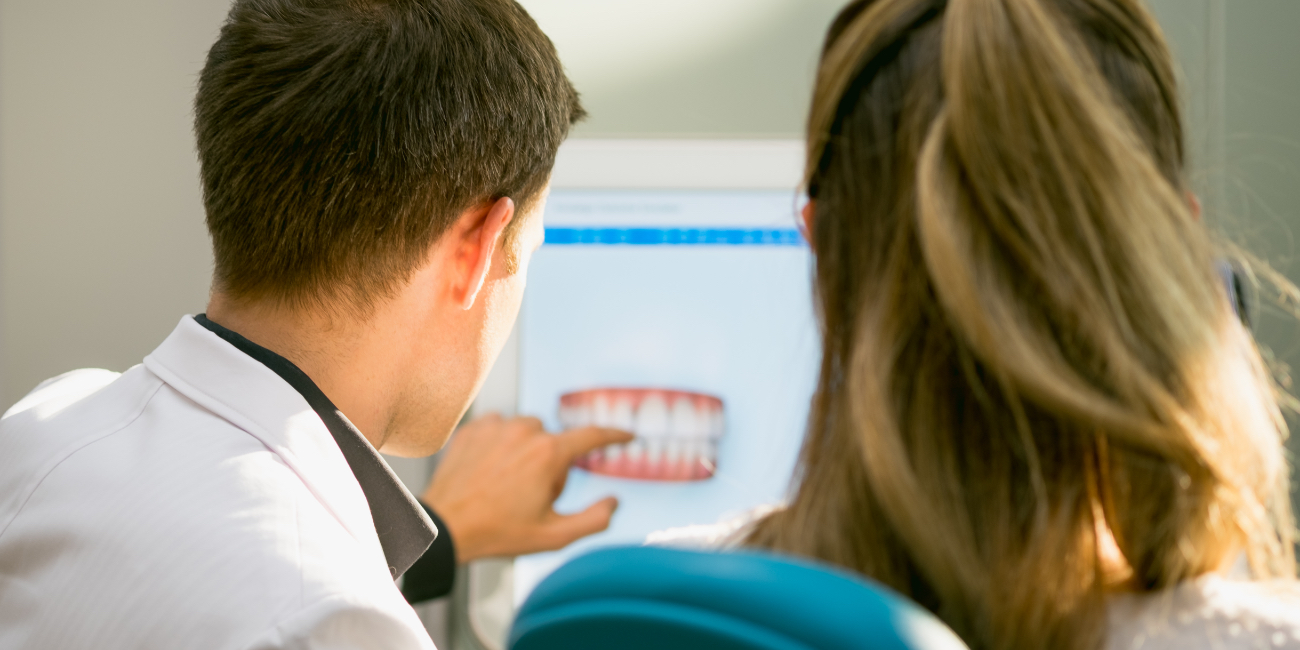
Knowing that the majority of his clientele were 18 and under, we wanted to create a brand that felt fun and approachable to children and teens who were already nervous about the idea of having a stranger hanging out in their mouth for the coming months.
Initial presentations went really well. Although their team landed on a name of their own, it was good for them to see the thinking from an audience who wasn’t as attached as they were. They ended up taking a leap of faith out of the gate and steering towards an art direction that was completely oddball for the market.
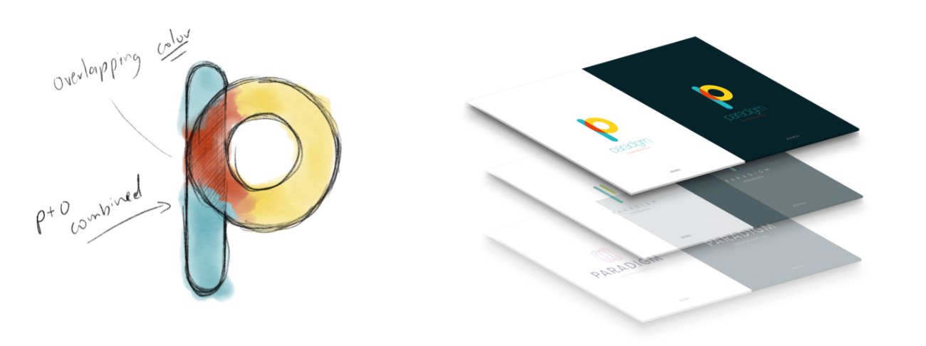
Along came Paradigm Orthodontics

The Cure
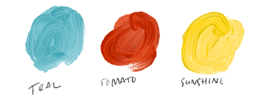
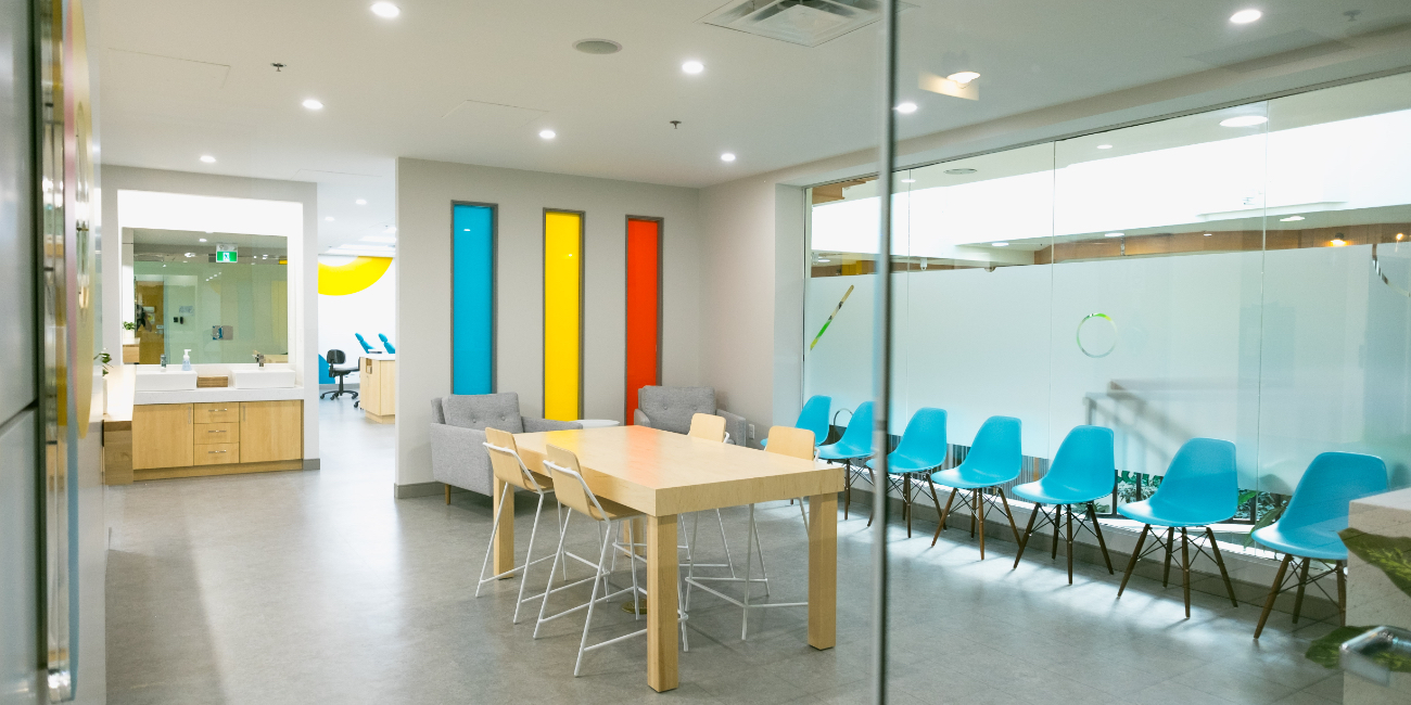
The brand was built using slightly tweaked primary colours and extremely simple shapes. This look would cater to their younger demographic while also having the clean professionalism to instil confidence in their parents that they were in good hands.
Teaming up with Mac Interiors in the early stages helped us establish the look we were going for.
The office space was being built in conjunction with a lot of our initial assets which assisted in creating a cohesiveness throughout the entire project. The textures and finishes were all Carefully chosen to bring an exciting and comforting feeling to the consumer. Everything from the rounded edges on the business cards to the soft maple finishes on the countertops – it all had a sense of belonging.
Super, Duper, Awesome, Slick, Relaxed, Professional
Project Numbers
-
0Teeth lost during project
-
391High Fives
-
3Broken P Signs
In this space, everyone just looks the same. Kudos for choosing to be the oddball!
DOSE Media
Related Case Studies
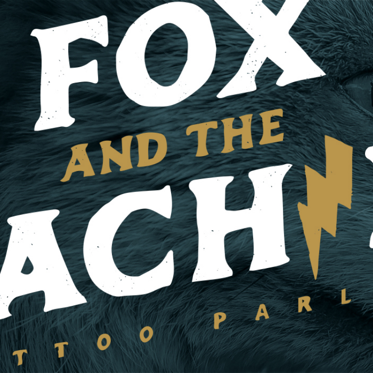
Fox and the Machine
Legend has it when they were plotting this venture in Dean’s living room, they were at a stalemate in name searching. And peering in the window at that moment was a red fox, staring right at them. The “Machine” was a nod to the tattoo equipment.
Quake Matthews
Quake Matthews, one of Canada’s elite underground musicians was looking for creative direction on his next project. He was channelling all of his energy into this next release and looking for assistance to craft some ideas to make a holistic body of work with a rollout that reflected the quality of the content.
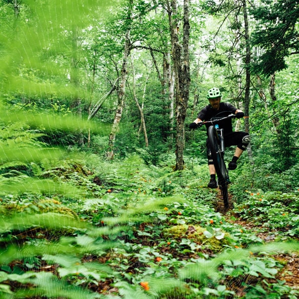
Mountain Bike Halifax
We worked with the association to help them establish a name, branding and a website to represent them moving forward.
Fox and the Machine
Legend has it when they were plotting this venture in Dean’s living room, they were at a stalemate in name searching. And peering in the window at that moment was a red fox, staring right at them. The “Machine” was a nod to the tattoo equipment.
Quake Matthews
Quake Matthews, one of Canada’s elite underground musicians was looking for creative direction on his next project. He was channelling all of his energy into this next release and looking for assistance to craft some ideas to make a holistic body of work with a rollout that reflected the quality of the content.
Mountain Bike Halifax
We worked with the association to help them establish a name, branding and a website to represent them moving forward.