Recess Catering
Overview
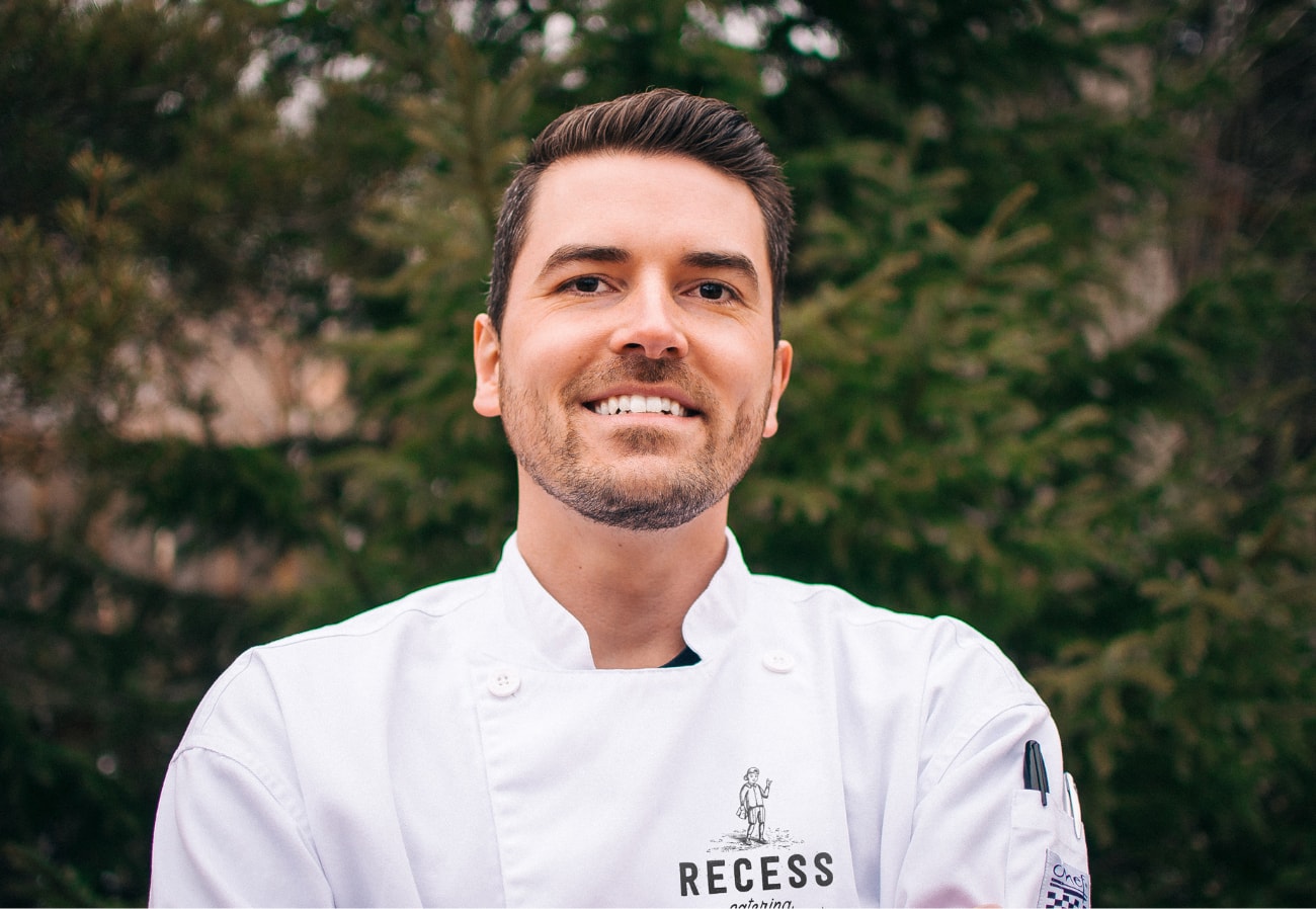
A born & bred Newfoundlander, Mark Babstock grew up in a family of talented cooks and bakers. He worked in kitchens from coast-to-coast before focusing his culinary passion on catering weddings, corporate, and private events. He needed to build a brand that was as fresh as his ingredients in order to stand out. Mark is an easy-going character that has the ability to connect with customers on a professional and personal level – always cracking jokes and referencing quotes from your favourite 90’s TV shows and movies.
Mark is a fresh face in an old scene. He had a real opportunity to step out and offer something different than the competition – modern catering that is both delicious and conscious of everyone’s dietary needs.
My project progressed very smoothly, at a pace and direction that was well-communicated and clearly mapped out from the start. The quality of the work they delivered was honestly beyond anything I could have imagined it to be.
Chef Mark Babstock

The Process
We aimed to create a catering brand that had a modern spin, is super fun, and includes hints of nostalgia. If you look beyond the name, the logo, and the illustrations to the food itself, it should reinforce the brand world as a whole. We collaborated with Mark to come up with leave-behinds, sample packs, and snacks that would bring customers back to their favourite time of day. This is how Recess was born.
Recess was the most exciting part of everyone’s day growing up; the hopscotch, hacky sacks, trading your fruit roll-ups for gushers or dunkaroos for dry Mr. Noodles. We aimed to inject these memories into the brand at every touchpoint.
After the name and the vision were set, it was time to look at how we would roll this out. Recess needed a brand that was versatile enough to live online, in social media, in person, on apparel, and in packaging the food itself.
The Cure
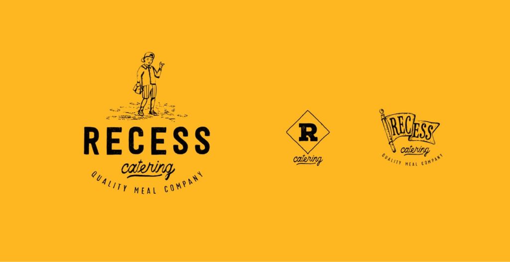
We created a series of illustrations & supporting graphics that felt true to their inspiration – old school kid’s books. Injecting that nostalgia into the brand world made Recess feel familiar, approachable, and modern. It stood up against the competition immediately and set Chef Babstock up with a brand system as versatile as his menu.
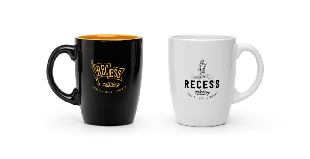
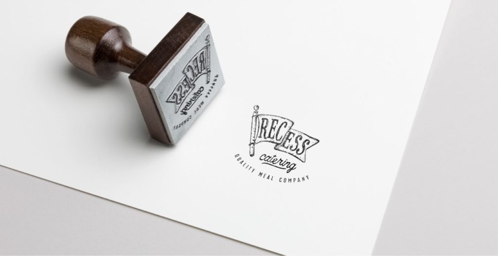
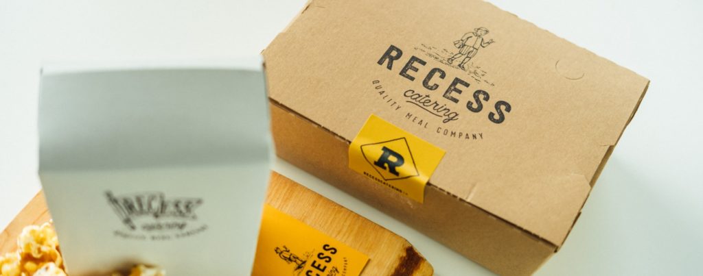
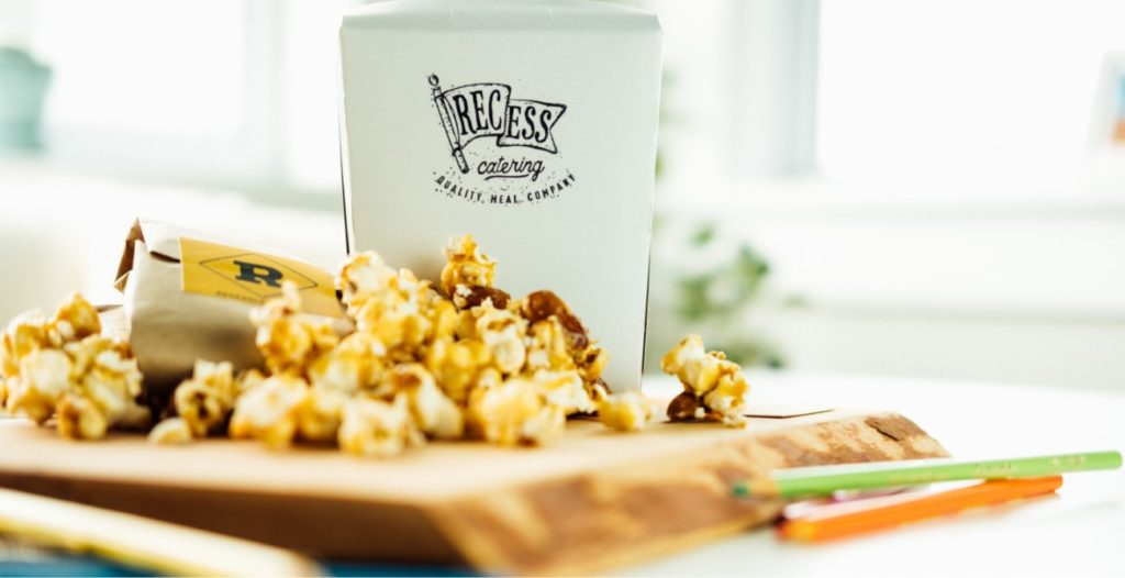
To keep start-up costs down, we created a variety of stamps and stickers to plaster on the delivery packaging and ensure Recess always felt cohesive, fun, and professional. When customers see the care put into his brand at every touchpoint, they know they’re in good hands.
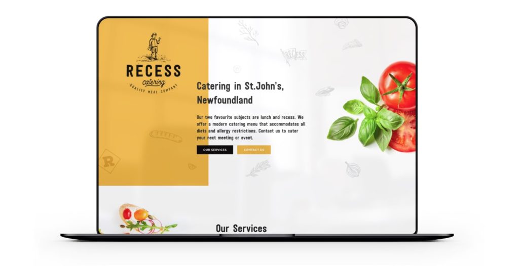
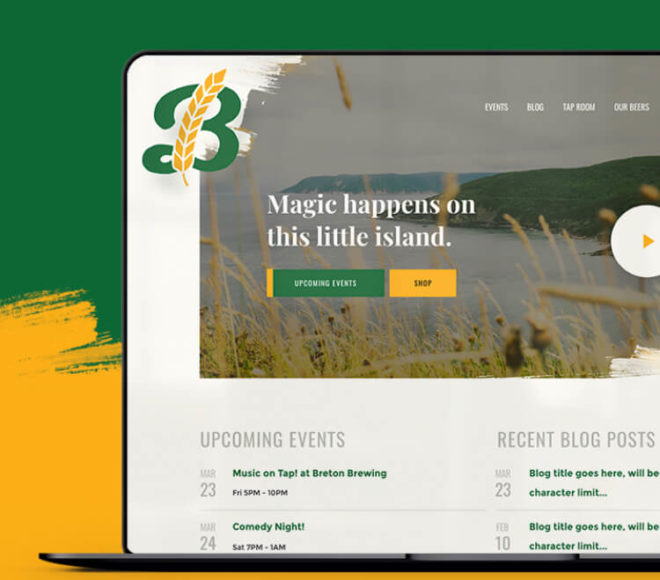
The website makes it easy for customers to learn about Recess, see sample menus, and get in touch.
Recess is already shaking up the scene in St. John’s. You better hurry if you want to book them for your next event.
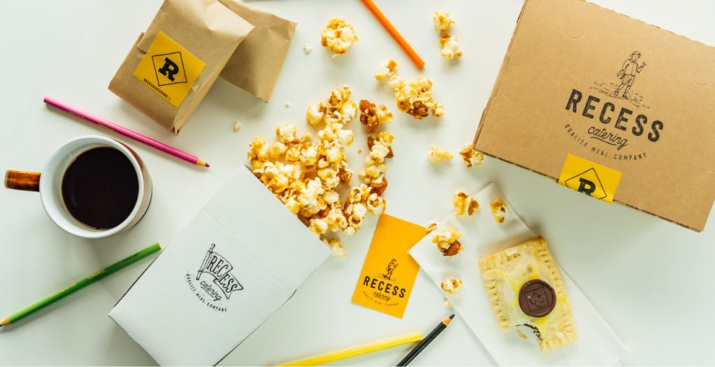

Positive comments from family and friends are to be expected, but when clients ask for extra business cards because they love the logo so much, and want to show colleagues – you know someone did something right.
They built me a Lambo in a space where everyone else is ridin’ a hooptie.
Project Numbers
-
3Recess stamps
-
5Pop tarts eaten during this shoot
-
#1Caterer in St.John's
Check out this guys’ Instagram feed and try not to drool on yourself
DOSE Media


