King’s Wharf
The Ask
As King’s Wharf grew in size and magnitude they needed a hand streamlining their marketing efforts. The development site, now containing 4 buildings with another batch on the way and numerous on-site business ventures had lost sight of it’s voice and needed a hand getting back on track.

The Analysis
Kings Wharf is an incredible venture. The 20 year project will redefine what luxury waterfront living means to maritimers. The mouth of the Halifax harbour will never look the same as it truly is a work of art. Dose was brought on board to inject life into every facet of their brand. We took over the smallest of tasks, right up to naming and branding their biggest announcement yet, the 36 storey Maristella Tower.
We made it our mission to streamline their voice and build a consistent brand world that we could work inside of. We wanted to not only build equity in the existing brand mechanics but arm their team with new and refreshed tools that they could use to do their job better.
The Cure
Website
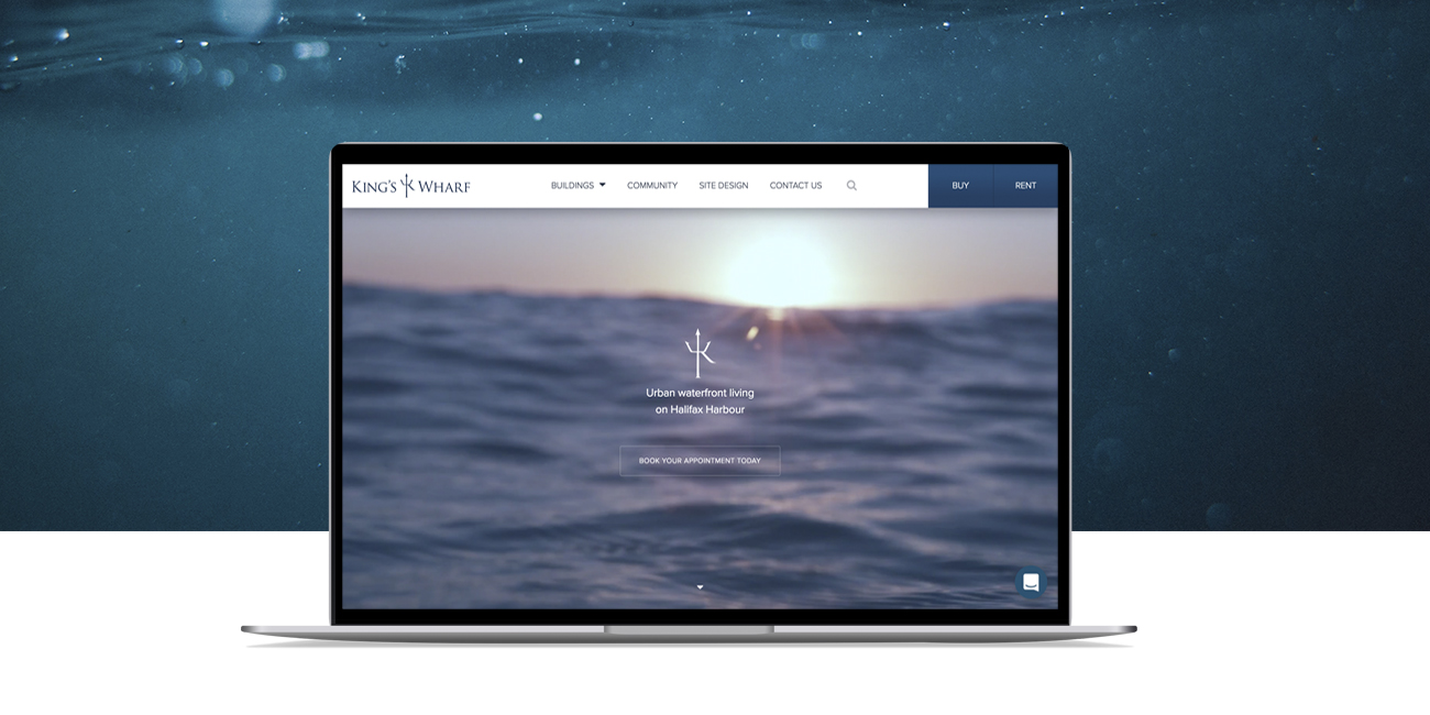
A complete website overhaul and SEO strategy was implemented to help build King’s Wharf online presence. We rebuilt the website from the ground up giving the user the ability to sift through hundreds of unit layouts across multiple buildings with ease. The restructuring of this information was a huge success, having helped their sales staff rent/sell nearly all of the remainder of their units to date.
The website also serves as means to better tell the King’s Wharf story. Upon landing on the home page the user has the ability to watch a beautiful 10 minute video giving great insights into the inspiration and passion that has gone into the project. The video is a perfect Segway to the rest of the site where each buildings back story is put on display with easy access to all features and amenities.
Social Media ads
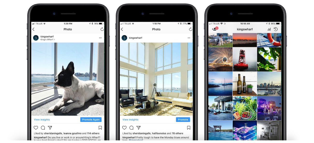
The numbers don’t lie. We embraced Facebook and Instagram’s advertising tools and achieved great results. Users were funnelled through engaging content in each platform and driven to the website to get the rest of the information they wanted.
Standard carousel ads were complimented by an interactive Canvas ad to deliver a rich user experience.
Social Media Content
We utilized King’s Wharf existing social platforms as a means to soft sell their product. By aggregating beautiful content that built up the surrounding community and activities that exist in close proximity to King’s Wharf, it further built the community up as a desirable place to live for the viewers.
The Tower
The 36 storey tower at King’s Wharf will be a special location. It will be the tallest building in Nova Scotia, standing proud at the mouth of the harbour. Hundreds of names were tossed before we landed on the Maristella tower – The star of the sea. We created an opulent branding package inspired by the already chosen names for the suites. Each was to be named after world renown artist, giving us an uber fun sandbox to play in when creating building the visual aesthetic.


Live Free BrewPub
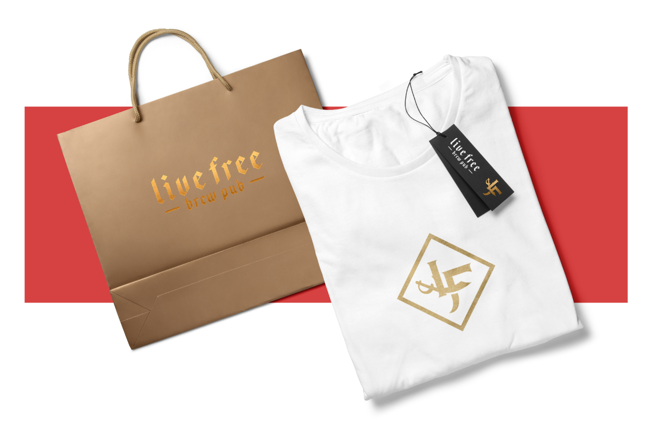
The brew pub at King’s Wharf is still a work in progress, but one piece of the puzzle is already set and ready to rock. Nova Scotia history is riddled with tales of pirates on the open seas. The pirate mentality was a huge inspiration for creating the branding for the waterfront pub. The entire community is highly polished, each building inspired and named by the ocean. It only made sense to give a small sense of rebelliousness and grit to the brew pub.

Water taxi
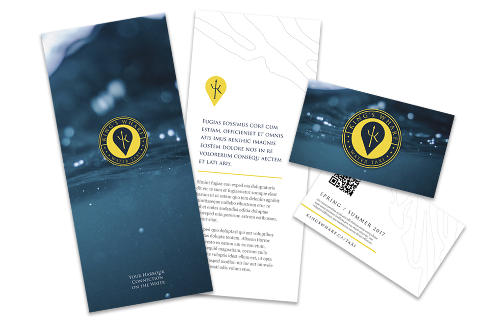
One of the most unique features of King’s Wharf is the water taxi. Parked at the on-site marina are two boats you can call upon to take you to your destination across the harbour. This amazing service has been around for years but somehow was flying under the radar of many locals. We revisited the branding of the crafts and created something more unique and recognizeable to work with. The new stationary, website and uniforms have all played a piece in building more awareness around one of the harbours hidden treasures.
In house products
Le Marché, the small boutique market at King’s Wharf was struggling to bring patrons through its doors. It was hard to see exactly where it was located on the ground floor of The Killick and passerby’s never knew what to expect of the store on the inside.
We created a ginormous vinyl wrap that skinned the entire storefront and set the tone for what to expect upon entering. We even had the opportunity to brand some of their signature products in the shelves inside, building further brand equity and setting Le Marché up for years of success, it truly is a staple of the community.
This project has been an absolute wilderbeast, but insanely fun to be a part of. Every other week another crazy idea pops up and we get the chance to help bring it fruition.
We brought Dose on board to help us create a new marketing strategy and refresh our brand. They have gone above and beyond what was asked and delivered not only an oustanding public facing product but one that has inspired our staff internally.
Project Numbers
-
136Jobs completed
-
742Francis laugh ticker
-
47Humble Pies consumed (It's down the street)
This project was an awesome opportunity to step out of our comfort zone and try a bunch of new stuff.
DOSE Media
