Our good friends over at Buoy Marketing were kind enough to bring us in on a couple more sports branding jobs this year. We had the pleasure of collaborating with them on the visual identity systems for the Windsor Royals and the Halifax Thunderbirds.
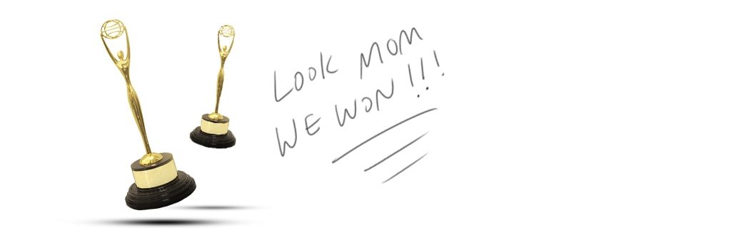
As if working on something this awesome wasn’t enough, they were both recognized at the 2019 Clio Awards. This was a massive accomplishment for all of us as a team and solidified our partnership together as a force when it comes to building sports brands.
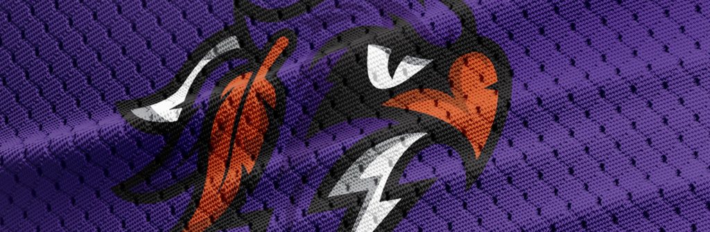
Halifax Thunderbirds
When we received the initial name and direction for the Halifax Thunderbirds we were thrilled. The owner of the team is a Mi’kmaq gentleman and he wanted the team to embody it in some capacity. The early exploration utilized a lot of interesting line weights and colour blocking that pulled heavy inspiration from their cultures illustrative style.
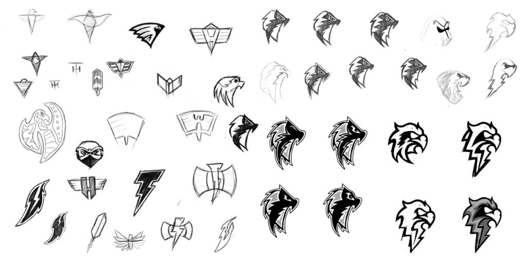
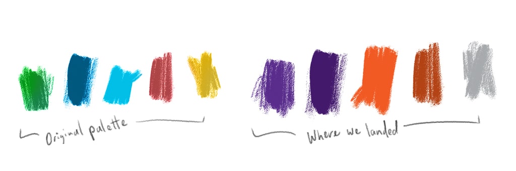
Once we nailed down the overall idea and shapes it was just a matter of cleaning it up and bringing it to life in the real world. Our original colour palette was derived directly from Mi’kmaq artwork – but the internal team on the client-side wanted to move towards a purple and orange theme.
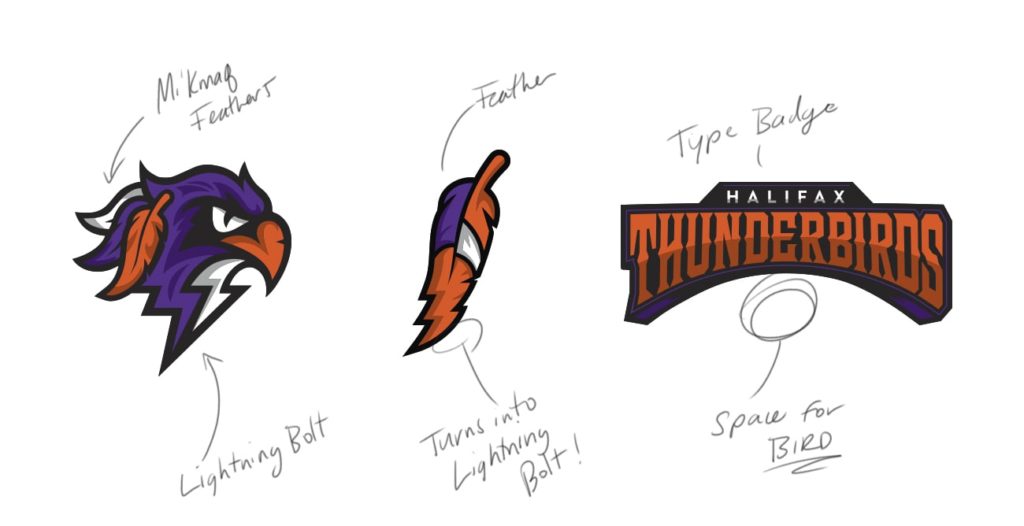
The logo set is comprised of three main components – The bird head, the feather, and the wordmark. Each unit serves its own purpose and can be used in many different ways throughout their merchandise, collateral, online and jerseys.
The jerseys are top secret right now – we’ll post them up when they’re revealed 😉
Halifax Thunderbirds – Brand Launch Live Event from Buoy Marketing + Production on Vimeo.
Windsor Royals
One of the co-owners at Buoy lives and is an active community member in Windsor, Nova Scotia. Their local hockey team the Avon River Rats was going through the process of renaming and creating a new identity.
We all jumped at the opportunity to give them a much-needed refresh and uplift the marketing, branding and spirit of the team.
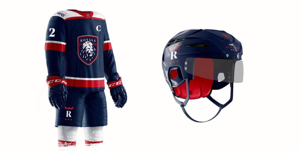
Its rich navy blue, red and white colour palette fits its proud heritage.
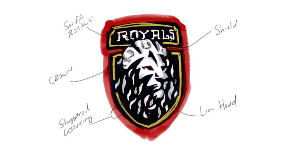
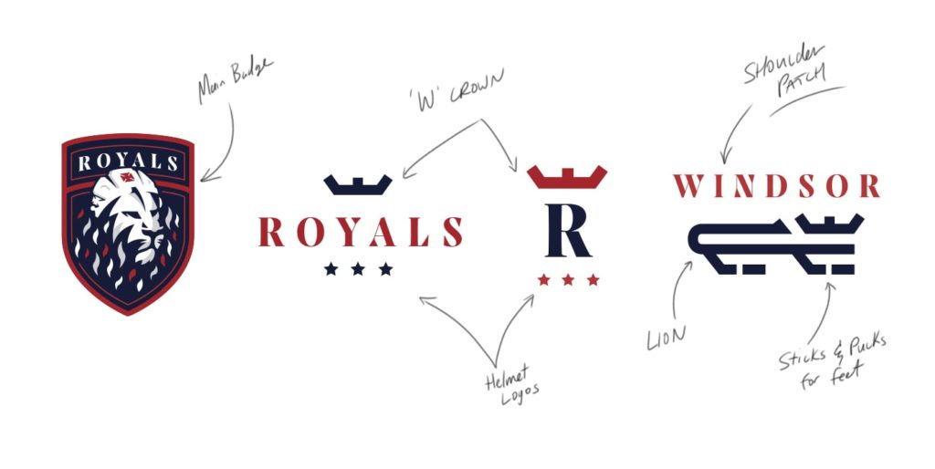
 The original Windsor Royals logo had a crown motif above the ‘W’ that we carried through into the new design. It can live on its own while also being infused into other elements throughout the design system. In the primary emblem, it is worn by a lion, fearless, confident and inspiring respect.
The end result is a fluid design system that has been received with open arms amongst the players and community. They now have a badge of honour they can wear with pride.
Windsor Royals – Brand Case Study Video from Buoy Marketing + Production on Vimeo.
Woohoo for getting kick-ass work and winning awards at the same time.